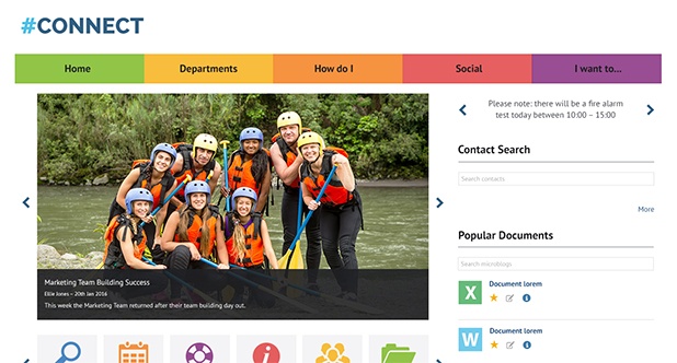
Your intranet has launched and it looks amazing! Great design, great content and everyone is logging in. As time passes though, it’s always a good idea to ensure your Intranet Manager has a mechanism to manage your intranet design changes. I thought it would be useful to highlight 4 areas that you should include within your intranet design governance. If you would like to find out more about intranet governance, download our free intranet governance guide.
All I mean by intranet design governance, is a way for you to keep an eye on and check your intranet is still following your design style sheets or whether it’s taken a different direction.
Intranet Design Governance Tips:
1) Imagery
When your new intranet was created you may have agreed some style sheets that set out image guidelines. This might have included guidance on whether you should use colour or black and white images, whether the images should be rounded, squared or any filters applied. At the point of launch I’m sure all of your images complied with your style sheets but how are they looking now?
In my experience, over time contributors upload imagery that sometimes doesn’t quite fit the original style sheets. Stock imagery might be making an appearance which goes against your style guide for natural images.
It’s worthwhile just spot checking your intranet’s imagery on a regular basis and also making sure all of the contributors are aware of the guidelines and have had any training they need in order to follow them.
If you can, creating a ready to use image library is a great way of minimising the chances of surprise imagery appearing on the intranet and makes the whole process of uploading content even quicker for everyone.
2) Publishing Content
When it comes to intranet content, you might have a team of intranet contributors that were trained on writing and uploading content. Over time the content might digress from the guidelines. Titles may get longer and the content tone and length may become inconsistent.
Regular meetings with the content contributors are a great way to ensure that everyone fully understands the guidelines and is fully trained on content creation.
3) Colour
Design and colour go hand in hand. The intranet you launched with should have a colour pallet that works with your brand and reflects your organisational culture.
When you are spot checking the intranet just check the colours are all correct and any buttons added post launch are consistent with existing buttons and action flags.
4) Consistent Identity
Underpinning all of the points I’ve raised here, is the need to just check your intranet is consistent. Would your end users recognise your intranet now? Does it link to your brand? Make sure any staff photos follow the same guidelines, the copy tone is right and any videos uploaded are also on message.
All of the 4 points I’ve highlighted shouldn’t create additional work but instead be integral to people’s roles as part of the original intranet implementation. It's fine for your intranet to design to change over time, in fact its important it does but it's just as important to understand why it needs to change and what are the changes trying to achieve.
If you would like to find out more about intranet governance, download our free intranet governance guide.

